4 Tips to Improve New Patient Signup on Dental Websites

Website design has a drastic impact on new patient signup for any service-based business. But dentists are already dealing with 60% of clients suffering from anxiety when visiting the dental office. Improving a dental website’s design can help improve patient signup by more than 100% and potentially reduce anxiety in the process.
These tips can help:
1. Use Feeling Invoking Colors
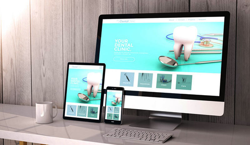
A site’s design can use colors to evoke emotion, and this is why you see so many dental sites use light blue colors in their designs. The light blue coloring is used for a few reasons. Blue has been shown to be:
- Calming
- Inviting
Blue has also been shown to invoke a feeling of safety and calmness. The color blue has the unique advantage of being a versatile hue that can be used in different shades to provide a feeling of calmness and serenity.
2. Minimalistic is the Only Option
Fear already exists in the dental field, and allowing for a page to be cluttered will make users even more anxious. When you add too many options, you’re going to do exactly the opposite of what Hick’s Law recommends.
Hick’s Law claims that when there are more options, it increases the time for a person to make a decision.
If you have call-to-actions for:
- Scheduling an appointment
- eBook offers
- Newsletters
- Consultations
It’s going to increase the time it takes for a potential client to book an appointment with the dentist. Instead, it’s better to reduce the CTAs to one or two, and you’ll want to make pages for each service to reduce increasing fear and options.
3. Educate Readers on Procedures
Information is key to reducing a patient’s fear, and this is where blogs and videos can help. You want to be able to educate the site’s readers on pages and in blog posts. Dental implants are a procedure that patients want to know more about and invokes fear due to the complication of the procedure.
A good example is a dentist that offers dental implants in Houston.
The company’s implant page includes everything a potential patient would want to know about implants, including:
- What they are
- Who they’re for
- Advantages
- Cost
- FAQs
- Procedure time
- Special care requirements
- Types of implants
A person who is interested in implants can have all of their questions answered on the page so that they can schedule the procedure with confidence.
4. Add Social Proof and Testimonials

The final piece of the puzzle is to add social proof and testimonials to the page. Statistically, 93% of locals will read reviews before making a purchase or using a service. You want to make these positive reviews key to your website’s design.
You’ll want to add reviews and testimonials as a key part of your marketing strategy.
My doctor recommended me taking Valium to reduce anxiety. Overall, I’m satisfied with the effect of the medication. I feel much calmer, and my quality of life has definitely improved. I know that I may develop tolerance to Valium from https://dentalhealthspa.com/valium-diazepam/. But as of now, there’s not any problem with this.
Don’t make separate pages for these elements. You’ll want to add testimonials and social proof to your landing pages and services pages to help build more trust to influence the visitor to take action.
Dental websites can be improved with these four simple tips to help boost conversion rates drastically.


Leave a Reply